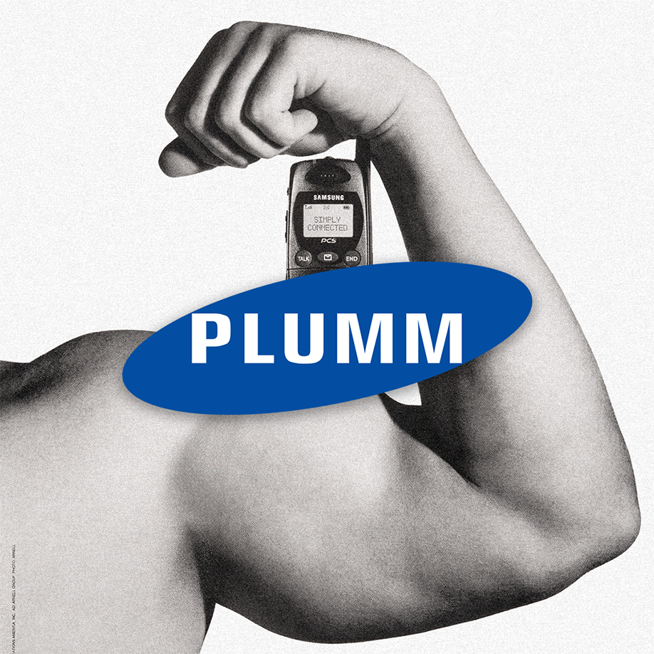
Did you know that Samsung was originally a grocery trading store that supplied rice, dried fish, and noodles into neighbouring China? The company has grown drastically since the 30’s, and as they changed directions, so did their logo.
They went through 3 logo changes before settling down in 1993 with the one we all recognise today- bold white sans serif letters inside a blue ellipse. This was a result of their need to modernise and develop their brand as they began to expand their international presence. The elongated blue oval symbolises the universe, a nod to the ‘3 stars’ on their first logos. The first S and the bottom of the G is designed to peek through the edge of its oval, to symbolise that the company isn’t afraid to explore unfamiliar territory in technology.
In 2005, the team decided to remove the ellipse and just retained the wordmark for a more minimal logo. After 29 years, this emblem is still what Samsung is known for.
Good branding lasts. #PlummAgency
