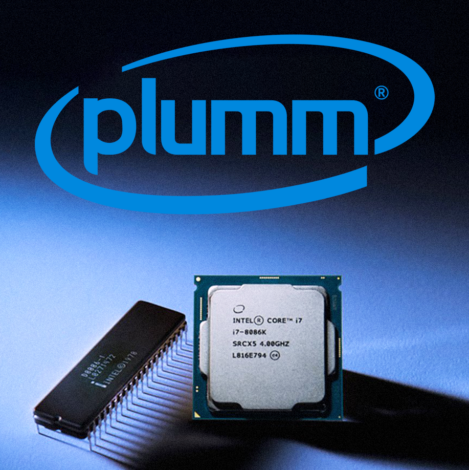
In 2005, Intel unveiled a new logo, replacing the one they’ve used for 37 years. FutureBrand Studio, who was in charge of the logo redesign, was inspired by elements of the Intel Inside brand and the first Intel logo.
They introduced this so-called “Vortex” which was a swoosh-like graphic element that surrounded the wordmark. It was meant to go hand in hand with Intel’s new slogan “Leap Ahead”. They also created a custom typeface called Neo Sans Intel, a modified version of Neo Sans by Monotype.
2 decades and a redesign later, this version of the logo is still what everyone associates with the tech giant.
Good branding lasts. #PlummAgency
