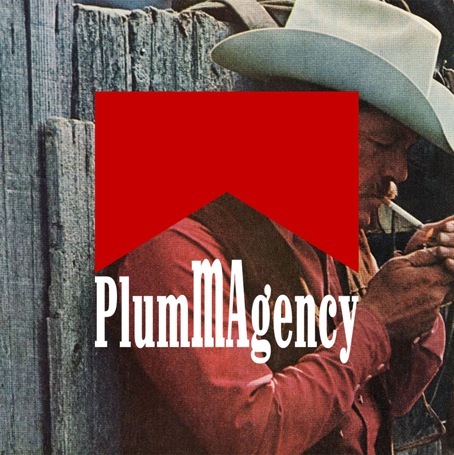
The world’s biggest tobacco brand has one of the oldest and most recognisable logos in the world. Marlboro got it right the first time; they redesigned their logo once in 1932, and it’s barely changed ever since.
The logo features a bold, condensed typeface in the Egyptienne style called Neo Contact, created by the German type foundry URW++. Their bookmark-shaped icon, which originally came in red for their main product, changes colour in their packaging to represent different product lines.
Used for over 9 decades, this logo is so iconic and timeless that it speaks for itself.
Good branding lasts. #PLUMMagency.