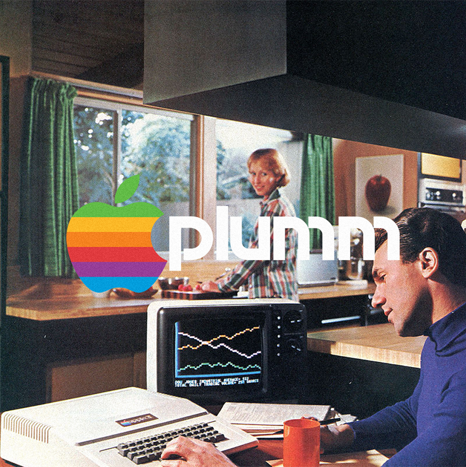
A year after co-founder Ronald Wayne hand-sketched the first Apple logo and left the company, Steve Jobs decided that they needed a logo refresh. He wasn’t happy with what the first logo represented; it was overly complicated and outdated, which didn’t align with the simple and modern values of the company. (If you don’t know, the first logo looked like it came from a mediaeval storybook.)
So in 1977, Jobs tasked Rob Jannoff, a designer at Regis McKenna, to create a better-fitting logo.
When asked how his approach in designing the logo, Janoff said: “It was very simple really. I just bought a bunch of apples, put them in a bowl, and drew them for a week or so to simplify the shape.”
The apple icon contained a rainbow spectrum, a nod to the Apple II being the world’s first computer with a colour display.
Even though it’s been through several versions in 2 decades, the Apple logo is one of the most iconic symbols in the world. It’s so simple, yet it represents so much: innovation, creativity, and possibility.
Good branding lasts. #PlummAgency
