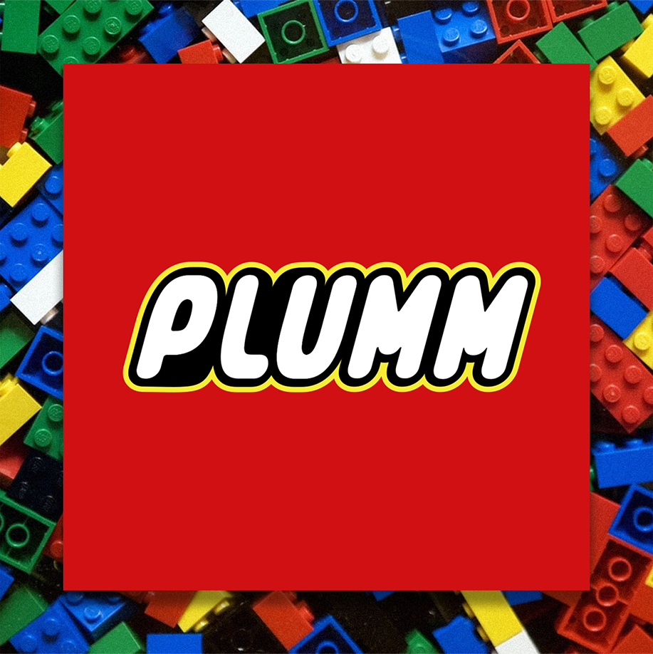
This square red, white, yellow, and black logo is synonymous with a childhood right of passage, but it didn’t always look so familiar.
Lego began in 1932, when carpenter Ole Kirk Kristiansen worked alongside his son Godtfred, aged 12. Their company adopted the name LEGO, an abbreviation of the two Danish words “leg godt,” meaning “play well. For the next 10 years, they mostly manufactured wooden toys- until, in 1949, they released the forerunner to the LEGO brick the ‘Automatic Binding Bricks’ and the rest was history.
Their logo underwent several changes over the 2 decades since their inception until they found the right direction in 1954. It was then we saw the first version of the red, white and black logo we know today. The red and black type was encased in a round red shape until 1960 when they introduced the rectangular logo and rebranded as ‘LEGO System’ with the word ‘system’ appearing in a yellow script typeface below the LEGO wordmark. They would go on use it throughout the 60s.
In 1972, they revised their logo to accompany their production and distribution in the USA. It was an attempt to create a single worldwide logo and remains the most recognisable version of LEGO’s brand identity. The red square remained and the logo was composed of a white wordmark in a double black and yellow outline. The letters were kept in a similar sans-serif typeface, looking bold, yet kid-friendly.
LEGO’s branding has always been a crucial part of its success. Today, anyone who sees the LEGO logo immediately gets reminded of a sense of childlike fun and inventiveness that only the beloved plastic toy block can bring out.
Good branding lasts. #PlummAgency
