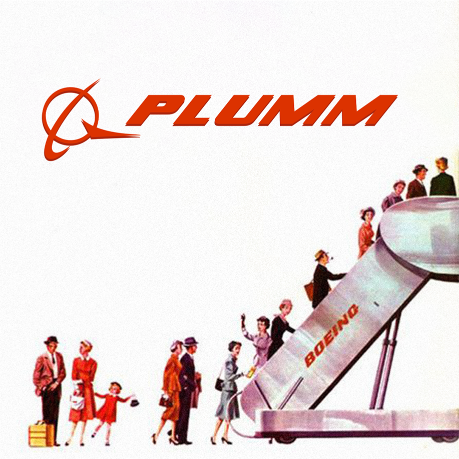
Boeing went through 10 different logos before finding one they’ll stick to for the decades to come.
Following 70 years of wing-inspired logos, Boeing decided to head on a different route. When Boeing merged with McDonnell Douglas in 1997, they needed a new logo that combined the identity of both companies.
Rick Eiber, a renowned American graphic designer, took on the task of refreshing their identity. He combined the existing Boeing wordmark with the McDonnell Douglas symbol, placing it on the left side.
The typeface called Stratotype was made in 1960 by designers Bob Laly and Kith Kinsmen specifically for Boeing. It is an oblique bold font that’s slanted to the right to display high-speed movement.
The company’s values of safety, quality, and integrity have been communicated through its logo for over 25 years.
Good branding lasts. #PlummAgency
