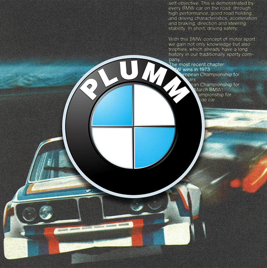
Many people believe the BMW logo is a stylised propeller. But the truth is a little different.
BMW – the Bayerische Motoren Werke or Bavarian Motor Works – dates back to 1917. Emerging from a renaming of the aircraft engine manufacturer Rapp Motorenwerke, located in Munich. When the name BMW was registeried in July 1917, there was no company logo. Similarly, the first ad from the same month also lacked any BMW symbol or emblem.
By October of the same year, BMW received their first logo, and it was very similar to what we still see today. The outer ring of the symbol was now bounded by two gold lines and bore the letters BMW. The quarters of the inner circle on the BMW badge display the state colours of the State of Bavaria – white and blue (Though inverse to voice local trademark law). The logo appeared on the streets for the first time in 1923, on the fuel tank of BMW’s first motorcycle, the BMW R 32.
So why all the mythology of the logo representing a propeller? A 1929 BMW ad depicts the BMW emblem, complete with the four coloured quadrants, in a spinning airplane propeller. The interpretation that the BMW logo represents a propeller has endured ever since.
In 2020, like so many others, BMW flattened their badge, removing the black background layer and any of its original depth, and replacing it with a single white outer line, and white lettering. But all in all, the logo has kept its bones since 1917. Even when the meaning behind your logo is a myth, good branding lasts.
