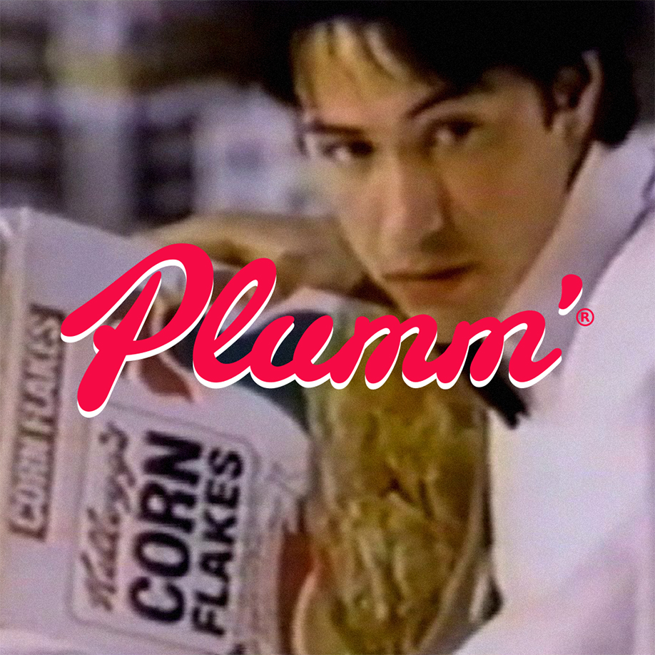
The iconic cereal brand that’s been operating for over a century has a logo that’s changed little from its first iteration. It’s based on the signature of its founder, William Keith Kellogg, showing that the brand values its roots. According to its brand lore, Kellogg used to sign every package personally to show that the products were genuine Kellogg products and eventually they decided to use this signature as the company’s official logo, dropping the initials “W” and “K” in the process.
Home to internationally loved brands such as Pringles, Froot Loops, Cheez It, and more, this brand has always made it its mission to deliver high-quality products to its customers with the Kellogg signature of quality. This guarantee evolved from the owner’s signature to its official logo. And to evoke a calmer and more luxurious vibe, the logo was crafted into the familiar cursive type that donned a burgundy colour that we’re all familiar with today.
Good branding lasts. #PLUMMagency
P.S – We highly recommend you Google ‘Keanu Reeves Kellogg’s Commercial’ from 1987 if not already familiar.
