In 1971. The founding trio of Starbucks originally named their company ‘Pequod’, a whaling ship in Herman Melville’s American classic, Moby Dick. After deciding it was a bit peculiar, they renamed it to Starbucks, chief mate on the Pequod.
The first-ever Starbucks logo featured a twin-tailed mermaid, inspired by the Greek myth that mermaids lured sailors to a shipwreck off the coast of an island in the South Pacific, also sometimes called the Starbuck Islands. The founders saw themselves as the mermaids and the sailors as coffee lovers everywhere.
In 1987, the logo design changed when its new owner, Howard Schultz wanted to simplify the logo and make it look more corporate. The original name, Starbucks Coffee, Tea, and Spice was dropped and simply changed to Starbucks Coffee. Despite all the changes, Starbucks still got to keep their original mermaid icon.
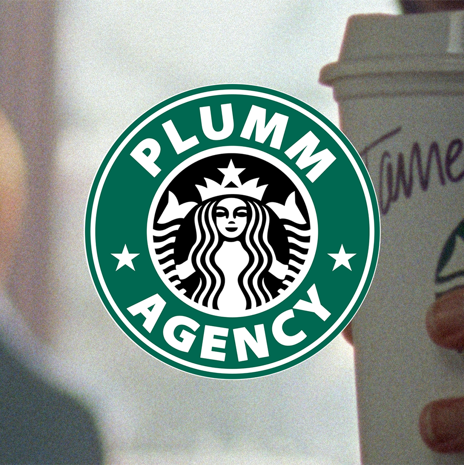
The Starbucks logo we see here is the modernised version of the 1987 logo, made in 1992 and used until 2011. Even after the logo change, this still one takes the cake (and coffee) in people’s minds.
Good branding lasts. #PLUMMagency
