Established in 1998 by founders Larry Page and Sergey Brin, Google has always placed emphasis on out-of-the-box thinking and this shows in the progression of their logo. The search engine’s original name was called Backrub. It was in reference to the underlying technology used, which was backlink tracking.
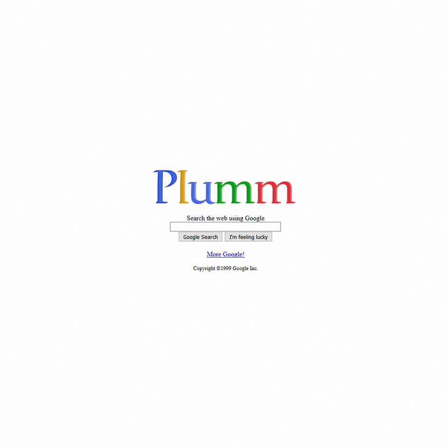
Sources say that the first-ever logo for the brand was made by Brin with the GIMP image editor. But moving forward, Google went on to have an experimental logo history at the hands of Ruth Kedar, who was a Stanford Assistant Professor. She designed a variety of possible logos for the search engine, from adding a Chinese trap in between the two “O”s to turning one “O” into a magnifying glass. But eventually, one was chosen from the wide selection of logos that were presented. It was a serif logotype that lasted until 2015. Ruth explained that she changed the colour of the letter “L” to a secondary colour to emphasize the company’s penchant for not following the rules.
But by 2015, the company felt it needed a brand refresh as the fast-moving design of the digital world made it seem like the company’s current logo was outdated.
And refresh they did. The redesign made the Google colours pop more and gave the brand an overall more approachable look.
But they didn’t stop there, Google launched this initiative called the Google Doodle wherein the logo is modified into various doodles or artworks for special events which eventually turned into having it modified daily with different artworks and features. As of late, there have been more than 4,000 doodles made and some are even playable.
Good branding lasts. #PLUMMagency