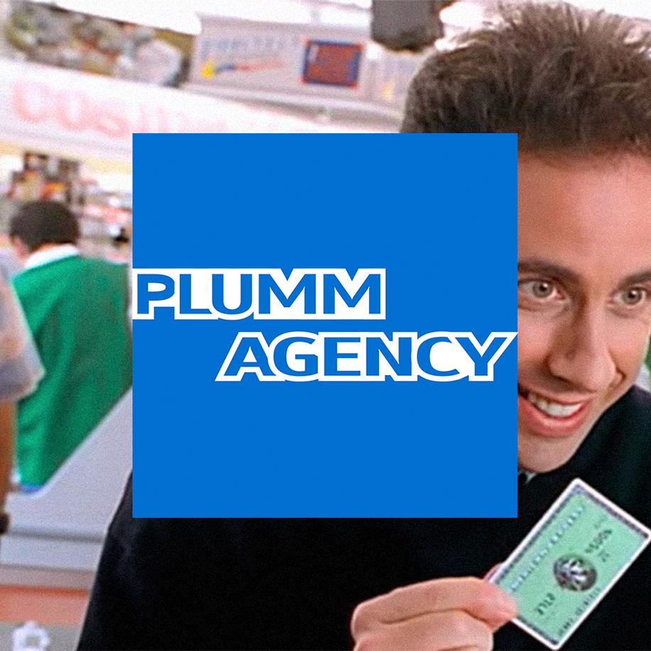
In its 171 years of operations, American Express only redesigned its logo 3 times. The well-recognised ‘blue box’ logo was introduced in 1974 to convey the bank’s adaptation into modernism, and not much has changed to it since then.
In 2006, a radial gradient effect was added to the logo, resulting in a different shade of blue. This version was used until 2018 when design firm Pentagram removed the effect and gave the bank’s brand identity a full refresh to strengthen a big brand for the small-space digital world.
Only a trained eye can spot the differences between the 1974 and 2018 versions of the logo. The blue box still works its magic after 46 years. Good branding lasts.
