When AuctionWeb changed its name to eBay in 1997, it was accompanied by a new logo, one that the team didn’t give much thought to. It was a plain eBay wordmark in a black serif font, all in uppercase with the ‘B’ enlarged, nothing else to it.
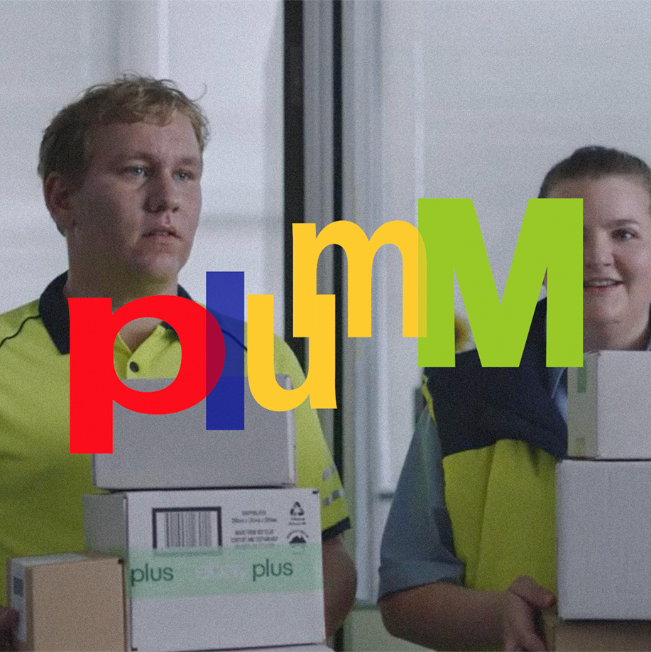
When eBay became incredibly successful in 1999, the team decided that it was time to update the logo. The redesign brought about one of the most beloved logos of the 2000s, a colourful emblem that defined early e-commerce. The colours red, blue, yellow, and green represented the diversity of the business, while the overlapping effect conveyed the connectedness of the eBay community. Overall, the logo set the tone for a fun-filled shopping experience that is accessible and user-friendly.
The golden years of eBay ended around the time that they modernised their logo to a sans serif wordmark. Even if the 1999 version of the logo is long gone, it’s the one that you think about when you hear ‘eBay’. Good branding (still) lasts.
