How Brand Design Influences Consumer Behaviour: Turn a maybe into a f*** yes.

Welcome to the dynamic world of marketing, where the visual identity of your brand isn’t just window dressing; it’s a critical bridge between your business and its audience. At PLUMM, we understand that branding design, with elements like your logo, colour palette, typography, and packaging, doesn’t just make a visual splash; it shapes how consumers see and connect with you. Dive into how brand design significantly impacts consumer behaviour, shedding light on how businesses can leverage brand identity design and brand style guides to create meaningful connections that last.

The Significant Influence of Brand Design on Consumer Perceptions

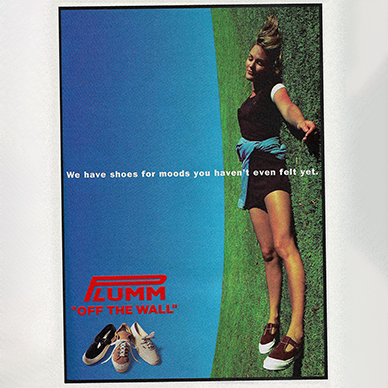
Logo Design: “Put your face on good n’ tight”

Your logo isn’t just a pretty face; it’s the beating heart of your brand’s identity. Here at PLUMM, we’ve mastered the art of creating logos that are not just memorable but downright unforgettable. Just take a look at how we’ve brought this to life for our client, Kitchen Daddy, making their brand not just seen but felt. A good logo, much like the ones we craft, ensures that first impressions not only count but stick around.

Colour Psychology: Why do Melbournians wear black all year round?

With PLUMM’s touch, diving into the psychology of colour in brand identity design is an adventure into the heart of your brand. It’s not just about looking good; it’s about evoking the right feelings, setting the right mood, and making those colours tell your brand’s unique story.

Typography: From Comic Sans to Helvetica

At PLUMM, typography is treated as your brand’s voice in visual form. Our expertise in selecting the perfect font tells a story, your story, in a way that’s immediately felt and understood. It’s about creating a conversation without saying a word, leaving a lasting impression on your audience.

Packaging and Brand Style Guides: Essential in Shaping Consumer Decisions

Packaging: More Than Just Product Protection

Consider your packaging the opening act to your brand’s main show. With PLUMM’s creative flair, packaging goes beyond protection; it becomes an unforgettable experience, creating moments that turn first-time buyers into lifelong fans. Who doesn’t love a product that knows how to make an entrance, especially when PLUMM is behind the curtain?

Brand Style Guides: The glue that might just hold your graphic designer together

Brand style guides are crucial, and at PLUMM, we craft these rulebooks to keep your brand’s visual identity not just sharp but irresistibly cohesive. They ensure that no matter where your brand pops up, it’s always ready for the spotlight, turning those f*** yes moments into everyday occurrences.

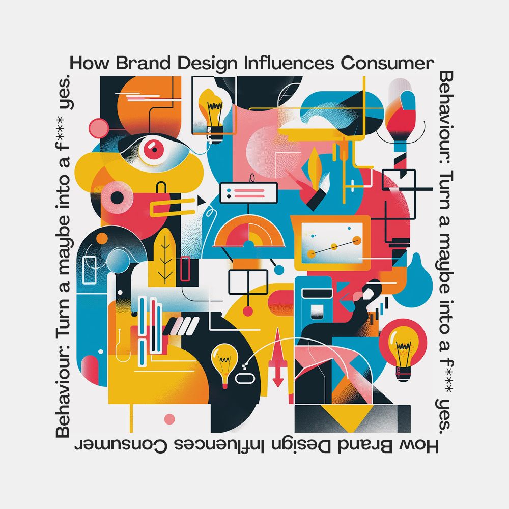
Conclusion: The Strategic Imperative of Brand Design in Modulating “Moody” Consumer Behaviour

Mastering the art and science of brand design is a concert, and PLUMM is at the podium, leading the orchestra. It’s not just about catching the eye; it’s about capturing hearts and sparking imaginations. In today’s competitive marketplace, letting PLUMM guide your brand design isn’t just a choice; it’s the beginning of standing out as the only option in a sea of maybes. 

So, let’s chat about letting your brand’s design do the talking, the PLUMM way, and watch as your consumer not only listens but leaps.

Off The Wall Branding

The origins of this casual and streetwear brand’s logo can be traced back to a stencil design made by one of the founder’s sons, Mark Van Doren. James Van Doren, Mark’s father, noticed the design and had it put on the heel of their Style 95 shoe, one of the very first models produced by Vans. At first, the logo was a plain black logotype made unique because of the line that extended on top of the “A”, “N”, and “S”.

Eventually, the logo donned a striking red colour and a tagline “off the wall” which is a phrase from Californian skaters’ jargon. One of their more iconic emblems includes the brand name and the tagline encased in a skateboard shape. Their logo still remains the same to this day and is representative of the skateboarding roots of the company.

Good branding lasts. #PLUMMagency

From Backrub to Googol to Google.

Established in 1998 by founders Larry Page and Sergey Brin, Google has always placed emphasis on out-of-the-box thinking and this shows in the progression of their logo. The search engine’s original name was called Backrub. It was in reference to the underlying technology used, which was backlink tracking.

Sources say that the first-ever logo for the brand was made by Brin with the GIMP image editor. But moving forward, Google went on to have an experimental logo history at the hands of Ruth Kedar, who was a Stanford Assistant Professor. She designed a variety of possible logos for the search engine, from adding a Chinese trap in between the two “O”s to turning one “O” into a magnifying glass. But eventually, one was chosen from the wide selection of logos that were presented. It was a serif logotype that lasted until 2015. Ruth explained that she changed the colour of the letter “L” to a secondary colour to emphasize the company’s penchant for not following the rules.

But by 2015, the company felt it needed a brand refresh as the fast-moving design of the digital world made it seem like the company’s current logo was outdated.

And refresh they did. The redesign made the Google colours pop more and gave the brand an overall more approachable look.

But they didn’t stop there, Google launched this initiative called the Google Doodle wherein the logo is modified into various doodles or artworks for special events which eventually turned into having it modified daily with different artworks and features. As of late, there have been more than 4,000 doodles made and some are even playable.

Good branding lasts. #PLUMMagency

Where did the inspiration for Visa’s branding come from?

Hailing from the sunny state of California, Visa’s brand colours are heavily influenced by its home state. The blue and yellow colours not only highlight feelings of trust and joy, but they’re also a reference to the majestic golden hills and bright blue skies of California. It was originally founded as a Bank of America credit card program and has since grown to be a multinational company that handles a big portion of the global credit cards.

Its current slanted design and winged “V” is meant to represent speed and movement in the logo giving it a dynamic look. Adding a gradient colour to the logo also made it more modern and futuristic. Visa remains to be a familiar logo that can evoke a strong brand recall not only because of its presence all over the world, but also because of its strong visual identity.

Good branding lasts. #PLUMMagency

You’ll never guess what the Gillette logo is hiding.

Gillette’s razor-sharp logo didn’t always look as dynamic when it was first established in 1901. You also might not have noticed the hidden symbolism in their logotype. Upon closer inspection, the logo has a continuous diagonal slice across the letters “G” and “I” that represent the double blades in their razors as well as the precise cut they give.

This logo was modified by the Anspach Grossman Enterprise and they used Futura Extra Black Italic to aptly symbolize the company. Featuring the double razors also allude to the well-known business strategy popularized by this product: the razor and blade strategy.

A simple logotype can contain so much information about a brand and its history, Gillette’s is no different.

Good branding lasts. #PLUMMagency

The short-stroll history of the Walkman logo.

At the turn of the century, Sony wanted to elevate the Walkman and take it into the future.

​Hiroshige Fukuhara, who was an Art Director for Sony at the time, was tasked to create a new logo that will achieve this vision. What came about was a blot-style emblem of the letter ‘W’ contrasted by a symmetric and futuristic typeface- a logo that would define portable audio for decades.

To our dismay, Walkmans were discontinued in 2009, but its legacy lives on.

#BringBackTheWalkman #PlummAgency

Branding Agency, Melbourne