Take a bite of the Apple logo.

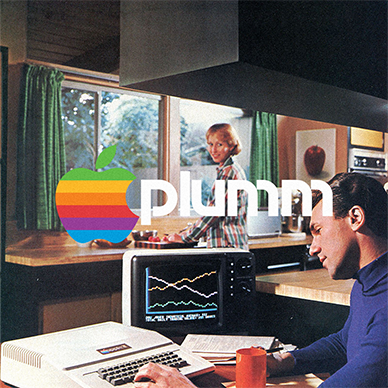
A year after co-founder Ronald Wayne hand-sketched the first Apple logo and left the company, Steve Jobs decided that they needed a logo refresh. He wasn’t happy with what the first logo represented; it was overly complicated and outdated, which didn’t align with the simple and modern values of the company. (If you don’t know, the first logo looked like it came from a mediaeval storybook.)

So in 1977, Jobs tasked Rob Jannoff, a designer at Regis McKenna, to create a better-fitting logo.

When asked how his approach in designing the logo, Janoff said: “It was very simple really. I just bought a bunch of apples, put them in a bowl, and drew them for a week or so to simplify the shape.”

The apple icon contained a rainbow spectrum, a nod to the Apple II being the world’s first computer with a colour display.

Even though it’s been through several versions in 2 decades, the Apple logo is one of the most iconic symbols in the world. It’s so simple, yet it represents so much: innovation, creativity, and possibility.

Good branding lasts. #PlummAgency

The history of the IBM logo now loading…

After the Computer Tabulating Recording Company changed its name to International Business Machines in 1924, they redesigned the logo from CTRCo in solid black lettering to the new name shaped like a globe.

With Business and Machines in a bold font, and International wrapped in the middle serving as the equator, IBM aimed to establish that they were expanding worldwide through the globe-shaped logo.

It wasn’t until 1956 that they changed their logo to the one we know today, the simple IBM lettering that conveys warmth and user-friendliness. Apart from the 13 stripes added in 1966 decreasing to 8 in 1972, IBM remained unmoved about their brand and logo. Good branding lasts.

Grab a cold one. The history of the Heineken logo.

The ‘Star-Heineken’ logo was created in 1991 to represent the brand’s embrace of modernism while simultaneously staying true to its century-old identity. This logo takes its roots most directly from the previous one designed in 1974, which features the same typeface and star element encased in a green oval insignia – you might have seen it as the iconic logo on their cans and bottles.

The logo is made up of the Heineken Serif typeface developed by design firm Eden that features a distinct bevelled ‘E’ and a classic red star placed above the lettering. The combination of the two elements, along with the green, red, and black colour palette make the image instantly recognisable.

It’s a timeless visual that will make you want to grab a cold one in a single glance.

Good branding lasts. #PLUMMagency

The history of the UPS logo now shipping.

UPS has been using this brown and gold shield logo since 2003 and has only made a few modern tweaks to it since.

The brand’s most recognisable element, the UPS shield, has been part of the company’s branding since its inception and has remained throughout 4 logo redesigns over a century. The first UPS logo was designed in 1916 by the founder, James Casey, and featured an emblem with an eagle carrying a package against a shiny bronze shield. The lettering on the package said: “Swift, safe and sure”. The logo being used today amplifies the same company values by adapting to modern demands while honouring its predecessors.

The brown and gold colour palette is also a great part of the company’s identity – so much so that the company is called “Big Brown” in some parts of the world. The golden typeface, manually designed by Paul Rand, echoes the 1937 logo and is meant to reflect the company’s long history and proud origins.

Good branding lasts. #PLUMMagency

Now accepting the history of the American Express logo.

In its 171 years of operations, American Express only redesigned its logo 3 times. The well-recognised ‘blue box’ logo was introduced in 1974 to convey the bank’s adaptation into modernism, and not much has changed to it since then.

In 2006, a radial gradient effect was added to the logo, resulting in a different shade of blue. This version was used until 2018 when design firm Pentagram removed the effect and gave the bank’s brand identity a full refresh to strengthen a big brand for the small-space digital world.

Only a trained eye can spot the differences between the 1974 and 2018 versions of the logo. The blue box still works its magic after 46 years. Good branding lasts.

Don’t step on the history of the LEGO logo.

This square red, white, yellow, and black logo is synonymous with a childhood right of passage, but it didn’t always look so familiar.

Lego began in 1932, when carpenter Ole Kirk Kristiansen worked alongside his son Godtfred, aged 12. Their company adopted the name LEGO, an abbreviation of the two Danish words “leg godt,” meaning “play well. For the next 10 years, they mostly manufactured wooden toys- until, in 1949, they released the forerunner to the LEGO brick the ‘Automatic Binding Bricks’ and the rest was history.

Their logo underwent several changes over the 2 decades since their inception until they found the right direction in 1954. It was then we saw the first version of the red, white and black logo we know today. The red and black type was encased in a round red shape until 1960 when they introduced the rectangular logo and rebranded as ‘LEGO System’ with the word ‘system’ appearing in a yellow script typeface below the LEGO wordmark. They would go on use it throughout the 60s.

In 1972, they revised their logo to accompany their production and distribution in the USA. It was an attempt to create a single worldwide logo and remains the most recognisable version of LEGO’s brand identity. The red square remained and the logo was composed of a white wordmark in a double black and yellow outline. The letters were kept in a similar sans-serif typeface, looking bold, yet kid-friendly.

LEGO’s branding has always been a crucial part of its success. Today, anyone who sees the LEGO logo immediately gets reminded of a sense of childlike fun and inventiveness that only the beloved plastic toy block can bring out.

Good branding lasts. #PlummAgency

Refuel on the history of the Mobil logo.

In 1964, design partners Ivan Chermayeff and Tom Geismar were tasked to develop a new logo and graphic identity for Mobil Oil Corporation that will position them as a radically cleaner, more modern service station. The previous logo featured the same colours, but in terms of type and icon, it was drastically different. With this redesign, Mobil was looking to become the oil company of the future.

The red ‘O’ in the logo was made to reinforce a design concept to use circular canopies, pumps, and display elements for a distinctive and attractive look. It also serves a functional purpose – to help pronounce the name correctly. Since the ‘O’ is emphasised, people could pronounce it as Mo-bil and not Mobile.

The designers also developed a complete corporate identification program for Mobil, built around the logo, a specially designed alphabet, the redrawn pegasus, a clear policy for colour, and a comprehensive design approach that integrated new graphics with the architecture. Included in their corporate identity program were the design of product packaging, vehicle markings, print material, posters, and all design, packaging, and sign standards for facilities throughout the world.

Good branding lasts. #PLUMMagency

Tudummmmmm. The history of the Netflix logo.

In 2014, Netflix needed to reintroduce themselves to the internet as the leader of online streaming, so they released a new website, a new brand identity, and of course, a new logo, which is the one we all know and love. The bones of the current logo was clearly taken from the one they used previously for over a decade.

According to New York-based design firm Gretel, who was commissioned to design the logo, their challenge was to ‘create something broad enough for a global brand but still unique and identifiable.’ The firm removed the background while making the wordmark bolder and giving it a drop shadow.

The company needed to further simplify the logo so it can adapt on mobile devices and social media. So the singular letter “N” logo was released. Though the emblem looks like it was taken out of the original logo, it was actually made from scratch and looks like a red ribbon folding over itself. Now, we can’t imagine watching shows without first seeing that iconic ‘N’ logo and hearing that well-loved ‘tudum’ sound. Good branding lasts. #PlummAgency

The Venti sized history of the Starbucks logo.

In 1971. The founding trio of Starbucks originally named their company ‘Pequod’, a whaling ship in Herman Melville’s American classic, Moby Dick. After deciding it was a bit peculiar, they renamed it to Starbucks, chief mate on the Pequod.

The first-ever Starbucks logo featured a twin-tailed mermaid, inspired by the Greek myth that mermaids lured sailors to a shipwreck off the coast of an island in the South Pacific, also sometimes called the Starbuck Islands. The founders saw themselves as the mermaids and the sailors as coffee lovers everywhere.

In 1987, the logo design changed when its new owner, Howard Schultz wanted to simplify the logo and make it look more corporate. The original name, Starbucks Coffee, Tea, and Spice was dropped and simply changed to Starbucks Coffee. Despite all the changes, Starbucks still got to keep their original mermaid icon.

The Starbucks logo we see here is the modernised version of the 1987 logo, made in 1992 and used until 2011. Even after the logo change, this still one takes the cake (and coffee) in people’s minds.

Good branding lasts. #PLUMMagency

It’s not what you think. The truth about the BMW logo.

Many people believe the BMW logo is a stylised propeller. But the truth is a little different.

BMW – the Bayerische Motoren Werke or Bavarian Motor Works – dates back to 1917. Emerging from a renaming of the aircraft engine manufacturer Rapp Motorenwerke, located in Munich. When the name BMW was registeried in July 1917, there was no company logo. Similarly, the first ad from the same month also lacked any BMW symbol or emblem.

By October of the same year, BMW received their first logo, and it was very similar to what we still see today. The outer ring of the symbol was now bounded by two gold lines and bore the letters BMW. The quarters of the inner circle on the BMW badge display the state colours of the State of Bavaria – white and blue (Though inverse to voice local trademark law). The logo appeared on the streets for the first time in 1923, on the fuel tank of BMW’s first motorcycle, the BMW R 32.

So why all the mythology of the logo representing a propeller? A 1929 BMW ad depicts the BMW emblem, complete with the four coloured quadrants, in a spinning airplane propeller. The interpretation that the BMW logo represents a propeller has endured ever since.

In 2020, like so many others, BMW flattened their badge, removing the black background layer and any of its original depth, and replacing it with a single white outer line, and white lettering. But all in all, the logo has kept its bones since 1917. Even when the meaning behind your logo is a myth, good branding lasts.

Eau de history of the Chanel logo.

The brand’s official logo story is that Coco Chanel designed her interlocking Cs logo in 1925, as a homage to a stained-glass window she saw from a chapel in Aubazine, France, where she spent most of her childhood.

However, many speculate that the logo was in reference to Coco Chanel and Arthur Capel’s 9-year romance, before Arthur’s death in 1919. There’s even a rumour Coco Chanel requested the design from Mikhail Vrubel, the Russian artist.

Theories aside, we know that the logo officially appeared in their Number 19 perfume bottle and hasn’t been changed since. The timeless fashion house has been using the same logo for almost 100 years and that’s simply the payoff of good design.

Good branding lasts. #PlummAgency

One logo for every application. The history of the Supreme logo.

When James Jebbia opened the first Supreme store in Manhattan, he wanted to commemorate the opening of the store by selling three t-shirts that were original to the brand.

One shirt featuring the rather simplistic Supreme logo that Jebbia’s friend had designed for him when he opened the store.

It wasn’t long, though, before the t-shirt that featured the Supreme logo began to outsell all other products in the store, and Jebbia realized that he was on to something special with this logo. Jebbia then began to design a wide range of other clothing products that featured the Supreme logo in a variety of colors. Before long, the Supreme logo had become a status symbol in the street culture of New York City, and the groundwork that would pave the way for the logo to become internationally popular in skating, hip hop, and rock circles across the world had been laid.

However, there was a degree of controversy about the logo’s design. After Jebbia’s friend designed the original Supreme logo, Jebbia felt as if the logo looked a little flat. In order to add more depth to its design, Jebbia lent his friend a book by New York conceptual artist Barbara Kruger for inspiration. In the end, the Supreme logo came out looking very similar to Kruger’s signature style of artwork, which featured bold white letters surrounded by the red font in order to portray a rebellious, anti-capitalist message.

Kruger didn’t own any copywrites on the logo itself, and no legal action could be taken against Supreme, but that didn’t stop the artist from commenting about how she was very displeased about the company so blatantly co-opting her signature style.

In spite of this controversy, though, there’s no denying the fact that the Supreme logo turned out the be very lucrative for the brand. The message that Kruger managed to convey with her artistic style fit Supreme’s target audience perfectly and the popularity of products that featured the Supreme logo skyrocketed, first in New York City and then across the world. Good branding lasts. #PLUMMagency

1999 and the history of the PayPal logo.

When PayPal burst into the scene in 1999 as an online payments system, they debuted a logotype, not drastically far from the one they use today, which featured their brand name in italicised modern sans-serif typeface with a a white fill and a thick blue outline. The lettering stood out because of its sharp angles and distinct contours.

PayPal’s visuals were taken in a better direction when they redesigned their logo in 2007, but they weren’t quite there yet. The logotype featured the company name in 2 shades varying shades of blue, rounded edges, a less angular typeface.

In 2014, PayPal needed a brand refresh as the landscape of e-commerce, along with their services, was radically changing. That’s when they introduced their most successful and recognisable logo to date. Fuseproject, the San Francisco design agency behind the design, changed the typeface, refreshed the colour palette and made a new version of the double-P monogram.

The company’s marketing director Alison Sagaar explains “The new wordmark is slightly tighter, so it’s more able to be used on smaller screens… also the monogram has been refreshed and tightened up, and it’s going to be used in conjunction with the wordmark to form the new signature.”

Sagar says they kept the blue colour palette because it had very strong brand recognition. Her team didn’t want to change it too drastically, so they just made the colours more vibrant to pop on both physical and digital formats. The angle of the letters also features “a more forward-looking slant, to reinforce the theme of innovation” Sagar states while citing the 58 product enhancements PayPal has introduced in 2013.

Today, the double-P monogram needs no introduction. PayPal future-proofed its brand while retaining brand recognition.

Good branding lasts. #PLUMMagency

Smoking, non-smoking and the history of the Marlboro logo.

The world’s biggest tobacco brand has one of the oldest and most recognisable logos in the world. Marlboro got it right the first time; they redesigned their logo once in 1932, and it’s barely changed ever since.

The logo features a bold, condensed typeface in the Egyptienne style called Neo Contact, created by the German type foundry URW++. Their bookmark-shaped icon, which originally came in red for their main product, changes colour in their packaging to represent different product lines.

Used for over 9 decades, this logo is so iconic and timeless that it speaks for itself.

Good branding lasts. #PLUMMagency.

The quick-sale history of the eBay logo.

When AuctionWeb changed its name to eBay in 1997, it was accompanied by a new logo, one that the team didn’t give much thought to. It was a plain eBay wordmark in a black serif font, all in uppercase with the ‘B’ enlarged, nothing else to it.

When eBay became incredibly successful in 1999, the team decided that it was time to update the logo. The redesign brought about one of the most beloved logos of the 2000s, a colourful emblem that defined early e-commerce. The colours red, blue, yellow, and green represented the diversity of the business, while the overlapping effect conveyed the connectedness of the eBay community. Overall, the logo set the tone for a fun-filled shopping experience that is accessible and user-friendly.

The golden years of eBay ended around the time that they modernised their logo to a sans serif wordmark. Even if the 1999 version of the logo is long gone, it’s the one that you think about when you hear ‘eBay’. Good branding (still) lasts.

Branding Agency, Melbourne